Time to grease up and hit the beach here in the bay area, 'cause it's October (our best weather of the year).
Wednesday, October 19, 2011
Wednesday, October 5, 2011
Further Exploration
Still exploring this guy. I'm not sure if I like this direction yet. I'll have to look at him for a few more days to decide. His face reminds me of the actor Phil Silvers (Sgt. Bilko, for anyone old enough to remember). Here he is anyway:
Saturday, October 1, 2011
Another Character Sketch
Finally, something that's not western themed. This is a fun character I was working on this week, hope you like it. Kind of looks like the "Early Bird" buffet line on a seniors cruise :)
Sunday, September 25, 2011
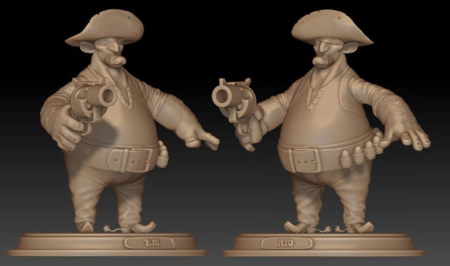
Video Turntable of my Zbrush sculpt
Here's a video turntable of my Zbrush sculpt.
You can see a higher resolution version in my web portfolio here (click the top right thumbnail image):
Labels:
3D Model,
Character Design,
Video,
Western Characters,
Zbrush
Friday, September 16, 2011
Zbrush Sculpt
It's finally finished! After spending the better part of my spare time this summer teaching myself Zbrush, I've finally finished my first Character Model Sculpt. It was a really difficult transition, having only used Autodesk's Maya for 3D work in the past, but it was well worth the effort. Zbrush is amazing, once you get the hang of it! I had a lot of fun and I'm really happy with how it came out:
And here's the Orthographic Drawings I created to sculpt from in Zbrush:
I'm hoping to create a couple posed versions of this character and render a turntable video to put in my Web Portfolio soon.
Labels:
3D Model,
Orthographic drawing,
Villain,
Western Characters,
Zbrush
Thursday, September 8, 2011
Another Version
I'm still working on the Zbrush sculpt, but I'll post it soon.
Tuesday, June 14, 2011
New Character Design
I've been trying to really dig into character design. Working my butt off on weekends and in my spare time. Here's an exercise (sticking with the western theme):
Wednesday, May 11, 2011
Character Design
I have so much respect for character designers, it's a much more difficult undertaking than most artists would think. Just trying to come up with original shapes and faces is hard enough, and when you add to that, trying to create shapes and forms that embody a specific personality and that will still be animation-friendly, you quickly see how complex and challenging the task is. I'm still just scratching the surface.
Wednesday, April 27, 2011
I Just Can't Stop
Friday, April 22, 2011
Western Theme Continues
Wednesday, April 20, 2011
In a Western Mood
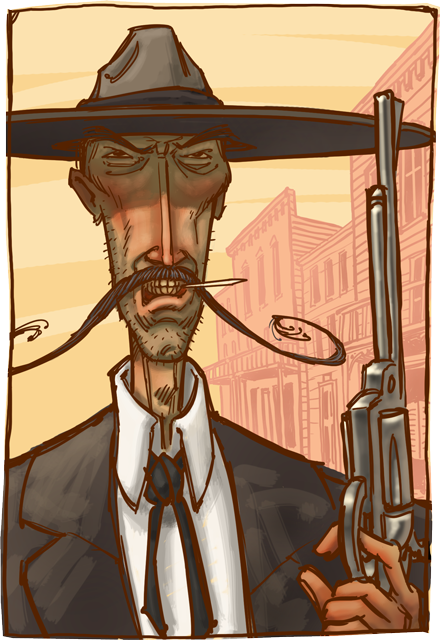
I'm feeling in a bit of a western mood this week, so I just went with it. This guy turned out looking a bit like Lee Van Cleef, one of the great Western Film villains of all time. It wasn't intentional, it was something I just noticed, when I was finished with the sketch.
Thursday, March 24, 2011
Red's
This is a spot I have many fond memories of, from my days at Sega Studios on King street. We were just across the street from the ball park, and Red's was a short walk down the Embarcadero. Great place to have a beer and a hot dog.
Wednesday, March 23, 2011
Western Edition
This is a sketch I did from an old Photo. It's in the Western Edition section of San Francisco, and this building probably no longer exists. Been a very long time since I posted, I've been massively busy at work. We finally launched our app today and everyone is really excited. I'm hopeful that I'll have a little more creative energy to put into my own work for a while.....
Friday, September 3, 2010
Finally Finished
Labels:
Art,
Illustration,
Retro Vacation,
River Cabin,
River Vacation,
Russian River,
Vintage Vacation
Friday, August 13, 2010
Back from another trip again.
I'm back from another vacation trip. We just spent four days in the Russian River resort area (What a coincidence, since that's what I'm currently painting). We had a fantastic time! Thanks to Margaret and Michael at the Fern Grove Cottages, (we always feel so welcome and have such a great time, when we stay there). I really got inspired and now I can't wait to jump right in and finish this piece. Here's the finished color sketch. I'm pretty happy with it, and I think the light filtering through the redwood trees is working much better now:
Saturday, August 7, 2010
Work in progress
Here is today's work. I'm really struggling with trying to get the feeling of light dappled through trees. I know this is only a black and white value study and that it will be easier when I can use the contrast of warm and cool light to help it, but it's still not there yet. The construction of the car still has some issues as well, but I'll iron those out before I go to the final color. I do think it's pretty successful at capturing the mood and feeling of the vacations of my youth. It remains to be seen if my color rendering can do it justice:
Thursday, August 5, 2010
Refreshed and ready to work.
Back after a short vacation. Nothing like escaping the dreary grey "summer" in the bay area. Several days spent breathing in high mountain air and swimming in clear blue lake water can really renew the spirit like nothing else.
Filled with that inspiration, I came home and jumped right into a new piece (influenced no doubt by my getaway). This is the paint-ready sketch, it took me several hours today to get something that captured the feeling I was aiming for. This piece is an attempt to capture the essence of the Russian River resort area (in Sonoma California) as I recall it from my childhood. I find it particularly difficult to simplify objects as I attempt to design them in a consistent and aesthetically pleasing way. That simplification is so central to good illustration (and good design). I really struggle with it all the time. It makes me wish I had attended Art Center instead of my Alma Mater. Ah, well, here is the sketch. I'll be updating with images of this piece in progress over the next few days:
Filled with that inspiration, I came home and jumped right into a new piece (influenced no doubt by my getaway). This is the paint-ready sketch, it took me several hours today to get something that captured the feeling I was aiming for. This piece is an attempt to capture the essence of the Russian River resort area (in Sonoma California) as I recall it from my childhood. I find it particularly difficult to simplify objects as I attempt to design them in a consistent and aesthetically pleasing way. That simplification is so central to good illustration (and good design). I really struggle with it all the time. It makes me wish I had attended Art Center instead of my Alma Mater. Ah, well, here is the sketch. I'll be updating with images of this piece in progress over the next few days:
Sunday, August 1, 2010
Off to a good start?
Well here it is Sunday and I still don't have any new art ideas to put in here. It's proving a lot harder than I thought to complete a new piece of art every week. A wife, two kids and the weekend hustle have beaten me down. I will try again later this week (I honestly did do a little work on the fix to the "Fat Cat"). In the meantime, I think I'll put up the last two pieces of digital paint I did, these are from the last few weeks.
The first one is just a piece I did trying to push my colors out of my comfort zone. I also wanted to keep it feeling fairly flat by collapsing the foreground, middleground and background and by using conflicting perspectives. Having it break out into the border area helps flatten it as well.
The second piece is an illustration about the fading of the american dream. I have an idyllic little house on a hill, with a car out front and a perfectly manicured yard. I contrasted the image with the aged and cracked paint and the dirty border (I'd always wanted to try and achieve that "cracked paint" look). Anyway that's all for today. I hope I'll have something completely new for my next entry.
Friday, July 30, 2010
First Post.
Well, this is the first of what I hope will be many weelky or semi-weekly posts. I am currently unemployed (layed off when Sega Studios San Francisco closed) and therefore technically "freelance". So with all this extra time on my hands, I figured I should put it to good use and start seriously stretching my digital painting muscles.
My aim with this blog, is to document and share my exploration of the digital paint process and my own observations, frustrations and triumphs with the medium. So here we go.
This is my most recent effort. The software used is Painter 8 and Photoshop CS4. The one issue and comment I've received on it, is about the large size of the electrical outlet. I have to agree, since the piece is about the sheer feline bulk of this cat and the oversized outlet is creating some confusion about his scale. It's certainly something I can fix though. I'll post a revised version, when I do it. Well now I'll have to come up with a sketch to share next week. I can feel the pressure already.
Subscribe to:
Comments (Atom)


